1. Display a Block Model
1.1. Block Model in 3D
Block models can be visualized in 3D with the Athos Render View or with the classical Render View. The following Representations are able to display a block model:
Surface, Surface With Edges
This is the most common representation of a block model and allows to color the model blocks (cells) by attributes, with or without the block edges.
Category, Category With Edges
This representation is like the Surface representations, but allows to “scroll” through the values of a Category attribute. Attribute and values can be selected in the Display tab of the properties panel.
Wireframe
Display only the block edges, with attribute coloring.
Feature Edges
Show only the overall shape of the block model with lines, without attribute coloring.
Volume
A representation that uses transparency to allow a view into the inner volume of a block model. The color scale is linked with a transparency scale, typically higher values more opaque and lower values more transparent. This is useful if a block model contains “lenses” or other shapes of higher concentrations of some chemical compound.
The other available representations (Points etc.) are less useful because the block model attributes are cell data, not point data, so the geometry can be visualized, but not the attributes with such representations.
1.2. Block Model as Points
For certain purposes it is helpful to display a block model not as cells (representing the blocks of the model), but as points. One thing could be the display with Points, Point Gaussian or 3D Glyphs representation. Another one could be the generation of a box plot as described in Box Plot.
The filter for this purpose is Cell Centers: It generates a dataset of only points without cells, located at the centers of the cells, and assigns the cell data to the point data, so the display with coloring by attributes is now also possible with the points.
Be Careful
At first sight it looks like the Cell Data to Point Data filter would be the way to go if we need point data for display, but this is not entirely true. The difference between the two filters is the following:
Cell Centers filter
The center points of every cell, thus our model blocks, are calculated for every cell (block), then the cell data are assigned to the newly generated center points.
Cell Data to Point Data filter
For every existing point in the block model, i.e. all the points where cells (model blocks) are touching, the average values of the attributes of the adjoining cells are calculated and assigned to these points. Note that with this the original information from the blocks is not any more represented.
1.3. Block Model Data in Table or Chart Views
Block model data can also be displayed as tables or analyzed with charts, in pretty much the same way as other tabular data: see Display Table (and other) Data.
1.4. Filters Supporting Block Model Data Analysis
A number of filters can help to visualize and analyze the data of a block model from different points of view. Some of them will be presented in the following sections.
1.4.1. Clip and Slice Filters 
A first visual impression of the distribution of qualities within a block model can be gained by applying a clip or slice filter, as shown in Fig. 1.1.
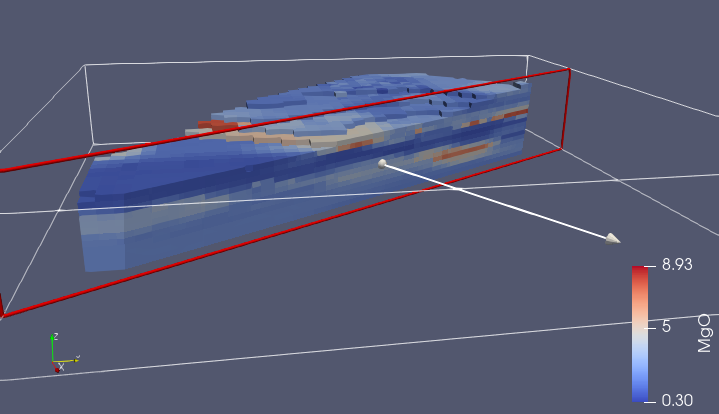
Fig. 1.1 The Clip Filter lets the user interactively move both the clip plane and the normal vector, and by pressing Apply, the model will be clipped along the current plane.
1.4.2. Fence Diagram
In geology and other earth sciences, fence diagrams are a common way to
visualize the inside of a rock volume. With AthosGEO View, a fence diagram can be
generated with the Slice filter with some advanced properties, so the
first step is to make sure that the Advanced features are activated
with the  button.
Now in the lower part of the Properties panel a list of values becomes visible that can be managed with the buttons at it’s right. The effect is that not only one slice will be generated, but any number of slices, with equal or variable distances, as shown in Fig. 1.2.
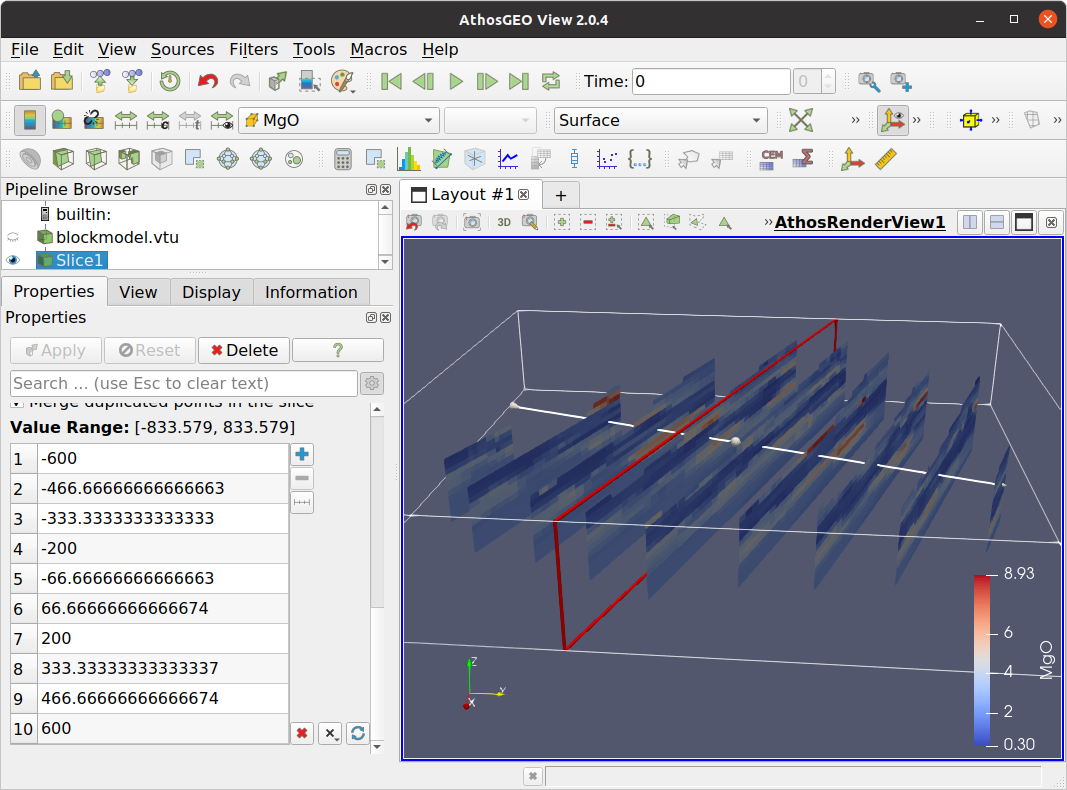
Fig. 1.2 The Slice filter allows to generate fence diagrams by defining a sequence of numerical offset values in the advanced properties of the Properties panel.
1.4.3. Threshold  
With the Threshold filter, blocks of the block model can be extracted that are within a specified value range of an attribute, as shown in Fig. 1.3.
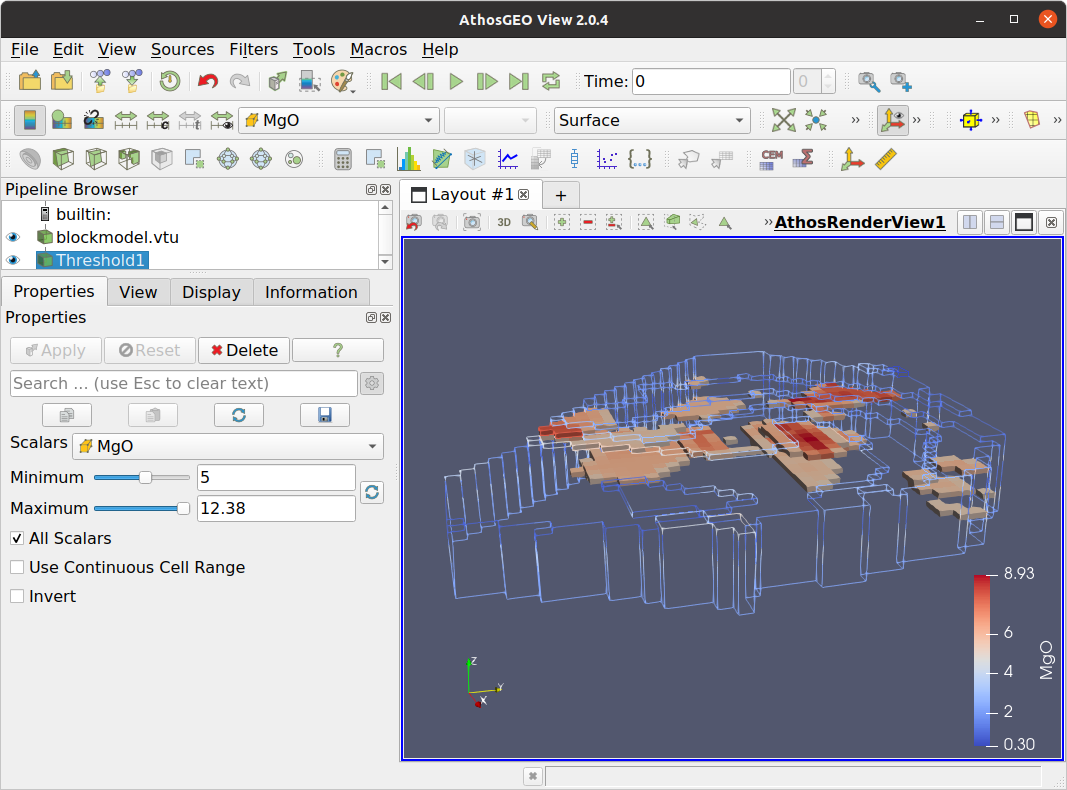
Fig. 1.3 In this example, blocks with MgO above 5% are extracted and shown inside a wireframe display of the entire block model. With this, zones of highest MgO content are easily recognized inside the rock volume.
1.4.4. Block Attributes I: Hover on Cells
A quick way to see a list of all attribute values of a model block is to press
the  button at the top of the 3D (Render) view. With this
turned on, the mouse can be moved over the block model, and wherever it stops,
a text pops up with a list of the attributes, as shown in
Fig. 1.4.
button at the top of the 3D (Render) view. With this
turned on, the mouse can be moved over the block model, and wherever it stops,
a text pops up with a list of the attributes, as shown in
Fig. 1.4.
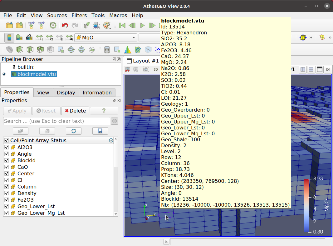
Fig. 1.4 With the button above a Render View turned on, a
list of all attributes will always pop up if the mouse remains above a
block in the model for a short moment.
This very easy method hits it’s limits in models with a high number of attributes, because in this case that function does not work properly: The list pops up, but if it is too large to fit properly on the screen, it will close immediately.
1.4.5. Block Attributes II: Probe Location  
The Probe Location filter works also if the number
of attributes is large.
On top of solving that problem, it also allows to write the numerical values of a block into a file. Basically, that filter allows to display the attributes of one single block in a table view (either Athos Table View or SpreadSheetView), as shown in Fig. 1.5.
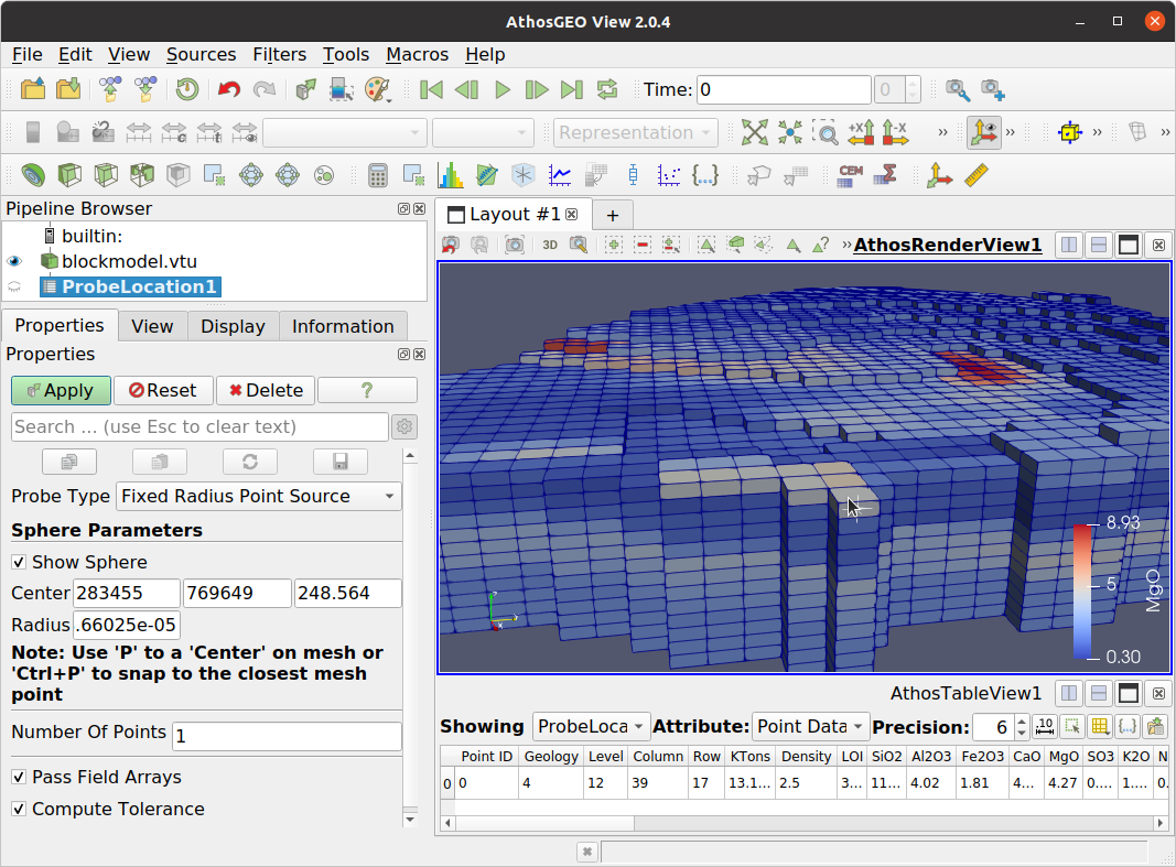
Fig. 1.5 With the Probe Location filter, the user moves the mouse to a block of interest and presses the letter P to mark a point in the model. Pressing Apply will open a table view that shows the attributes at that point (which is at the surface of a model block), from where it can be further processed, like written to a CSV file. In order to change the point of interest, move the mouse to another block, and press again P and Apply.
1.4.6. Block Attributes III: Selecting Blocks
A third way to show the attributes of a model block in numeric form is by making
use of the fact that selections are shared between different views. For this
purpose, open the same block model both in an Athos Render View and an
Athos Table View. In the latter, activate the Show only selected elements
option with the  button, and in the first, activate the
Interactive Select Cells On option with the
button, and in the first, activate the
Interactive Select Cells On option with the  button.
Now you can click on cells to select or unselect them, while the attribute data
of all selected cells will automatically be displayed in the table view, as
shown in Fig. 1.6.
button.
Now you can click on cells to select or unselect them, while the attribute data
of all selected cells will automatically be displayed in the table view, as
shown in Fig. 1.6.
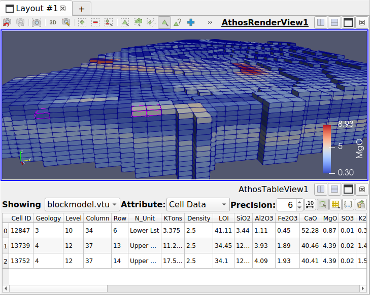
Fig. 1.6 In this example, the Athos Table View always shows the attribute data of those blocks that are selected in the Athos Render View.
1.4.7. Histogram  
This filter will generate more or less the same output as the Histogram View, as explained in Histograms. The only difference is that in a first step the Histogram filter generates a data table with two columns (bin_extents and bin_values), which then is displayed in a Bar Chart View.
1.4.8. Plot over Line  
The Plot over Line filter generates a plot that shows the variation of selected attributes along a line through the model, as shown in Fig. 1.7.
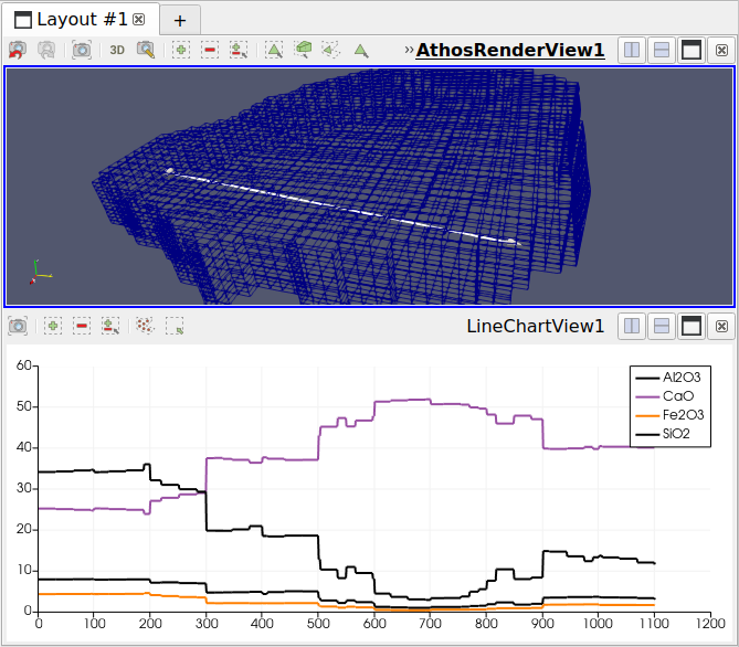
Fig. 1.7 For this Plot over Line, the line can be specified interactively or with coordinates in the Properties panel of the filter. The selection of the attributes is done in the Display panel of the Line Chart View.
1.4.9. Scatter Plot  
Selecting the Scatter plot filter and pressing Apply will generate a Line Chart View as shown in Fig. 1.8, which is probably not yet what we really want to see.
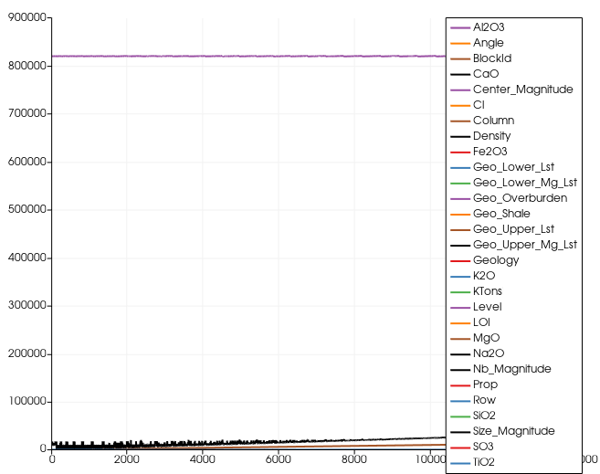
Fig. 1.8 In this initial Line Chart View, all attributes are plotted against the BlockID attribute of the block model - normally not very useful for a block model.
A scatter plot of one chemical compound vs. one or several others can be generated by adapting the properties in the Display tab of the Properties panel as follows:
Uncheck the Use Index for XAxis option and select a chemical compound as the X Array Name.
In the Series Parameters list, select the one or several compounds to be shown in the Y axis.
At the very bottom of the panel, change the Line Style to None (because we do not want to connect the points with lines) and select a Marker Style and Marker Size, for each one of the selected compounds from the list.
The result would be a scatter plot like in Fig. 1.9.
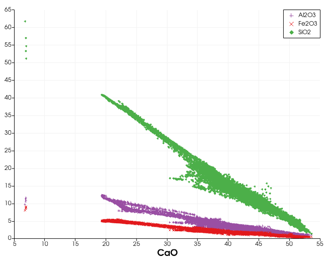
Fig. 1.9 A scatter plot showing Al2O3, Fe2O3 and SiO2 vs. CaO